Color and typography aren’t just visual choices — they determine whether people can perceive, read, and act on your content. Prioritize contrast (≥4.5:1 for body text), avoid color-only cues, use legible typefaces and relative sizing, tune spacing and line-length, and provide alternate high-contrast themes. Test with contrast tools, grayscale, color-blindness simulators, zoom, and real users.
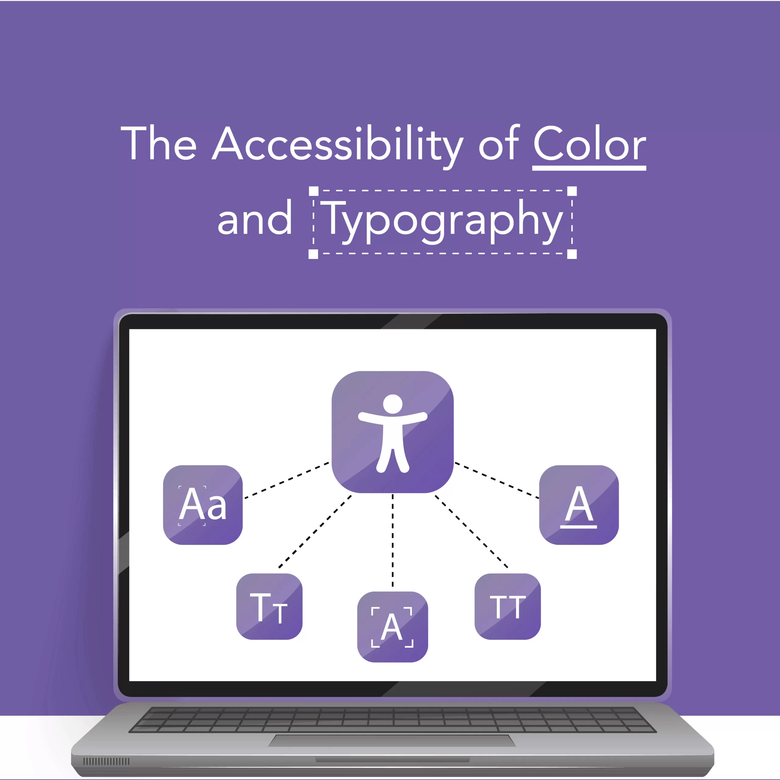
Why this matters
Small visual decisions cause big accessibility problems. Low contrast, tiny sizes, condensed tracking, and color-only status indicators create barriers for people with low vision, color-blindness, dyslexia, and cognitive differences. Accessible color and typography increase comprehension, reduce support requests, improve engagement, and expand your audience. These changes are practical design wins — not restrictions on creativity.
Design principles at a glance
- Perceivable: Make text and interface elements visible with good contrast and size.
- Operable: Respect user preferences (scaling, high-contrast modes).
- Understandable: Use clear hierarchy, line-length, and spacing so content is easier to parse.
- Robust: Implement semantic HTML/CSS tokens so user styles and assistive tech can interact reliably.
(Contrast guidance and general document-accessibility practices are recommended by institutional accessibility guidance — see University of Edinburgh accessibility guidance.)
https://www.ed.ac.uk/information-services/learning-technology/blogging/introduction/how-to-create-an-accessible-blog
Color: practical rules and patterns
Do
- Check contrast for every foreground/background pair. Prioritize body text, buttons, labels, and status text. Aim for at least 4.5:1 for normal text and 3:1 for large text.
- Use color plus another cue — icon, text label, shape, pattern — so information is not color-dependent.
- Create semantic color tokens (e.g., –color-error, –color-success) and pair each token with an icon and text.
- Offer a high-contrast theme or user override (respect prefers-contrast and system settings).
Don’t
- Use pastel text on light backgrounds for important content.
- Rely solely on red/green differences for critical states.
- Use tiny color-coded markers or tiny colored text without alternative cues.
Fast tests
- View pages in grayscale to catch color-only meaning.
- Use color-blindness simulators to verify distinctiveness.
- Run automated contrast analyzers on your palettes.
(Community examples and patterns are catalogued in accessibility blogs and design resources.)
https://www.digitala11y.com/accessibility-blogs/
Typography: clarity, scale, and rhythm
Do
- Base font sizing on relative units (rem/em) so users can scale text easily — 1rem ≈ 16px baseline is a solid start.
- Line-height: 1.4–1.6 for body text to aid reading rhythm.
- Line-length: target ~60–75 characters per line (or use max-width ≈ 60–75ch).
- Use readable typefaces for body copy (humanist sans or neutral serif); reserve decorative faces for short headings only.
- Provide clear weight contrast between headings and body; avoid ultra-thin weights for text.
Don’t
- Lock font size with px-only values (prevents user scaling).
- Use condensed or tightly-tracked fonts for running text.
- Justify long text blocks without hyphenation — it creates irregular spacing.
Dyslexia-friendly adjustments
- Slightly larger base size, larger x-height fonts, open counters, and increased letter-spacing can help. Offer an optional reading mode with these adjustments.
Micro-typography & layout patterns
- Headings: scale modularly (H1 > H2 > H3) with consistent weight and spacing.
- Paragraphs: keep them short — 1 idea per paragraph.
- Lists: use bullets/numbering with adequate spacing.
- Emphasis: prefer weight or underline; avoid combining very small sizes with italics.
Real checks to run (practical QA)
- Contrast analyzer for each text/background pair (aim ≥4.5:1).
- Grayscale rendering and color-blindness simulation.
- Browser zoom to 200% and check layout reflow.
- Keyboard navigation: visible focus, readable labels.
- Mobile scaling: ensure tap targets remain large and readable.
Automated tools help, but real user testing with people who have visual or reading differences is the most valuable validation.
Mini before/after example
Before: brand used 14px light-gray body text on white cards, condensed headline at heavy tracking. Users with low vision reported difficulty; analytics showed higher bounce on long-read pages.
After: body moved to 16px (1rem), color set to #222 (contrast ~6:1), line-height increased to 1.6, headline switched to a heavier weight with normal tracking. Result: longer session durations on long articles, fewer support tickets about readability, and better localization handoffs.
Quick copy-paste checklist
- Body text uses relative units (rem/em) and defaults to ≥16px.
- Body contrast ≥4.5:1; large text ≥3:1.
- Color never the only indicator — add icons/labels/shapes.
- Line-height 1.4–1.6; max line-length ~68ch.
- Headings form a semantic hierarchy.
- Focus styles visible and not removed.
- Support system high-contrast and scaling to 200% zoom.
- Test in grayscale and with color-blindness simulators; run real-user checks.
Tools & resources
- Contrast checkers and browser extensions (many available; pick one integrated into your workflow).
- Color-blindness simulators and grayscale view.
- Design tokens & style systems to centralize accessible color and type.
- For broader content-accessibility patterns, see institutional guidance (University of Edinburgh) and community resources (DigitalA11Y).
https://www.ed.ac.uk/information-services/learning-technology/blogging/introduction/how-to-create-an-accessible-blog
https://www.digitala11y.com/accessibility-blogs/
Publishing & handoff tips for design systems
- Publish a one-page style guide with color tokens, accessible type scales, spacing rules, and examples of correct/incorrect uses.
- Include code snippets and a high-contrast theme variant.
- Add automated linting in your design pipeline to catch low-contrast pairs and px-fixed sizes.
- Ship training micro-examples for content authors and engineers.
Conclusion + CTA
Accessible color and typography are design multipliers: they improve clarity, inclusivity, and product quality with modest effort. If you’d like, I can convert these rules into a Design53 theme: color tokens, font stacks, CSS variables, and a downloadable high-contrast stylesheet — or I can produce a one-page style guide and a small set of example components for your design system. Which would you like next?
Meta details (for publishing)
- SEO title: Accessibility of Color & Typography — Designing for Diverse Visual Needs
- Meta description (150 chars): Design color and type for real people: ensure contrast, legible type, scalable sizes, and alternatives to color-only cues.
Suggested images & alt text
- Hero: side‑by‑side theme comparison. Alt = “Side-by-side webpage showing normal theme and high-contrast theme.”
- Typography before/after: Alt = “Before: condensed small text; After: larger text with increased line height and spacing.”
- Color tokens palette: Alt = “Design token swatches showing primary, text, background, and high-contrast color variants.”
Accessibility QA checklist for publishers
- All images have alt text or are marked decorative.
- Contrast of UI screenshots and in-post images meets ≥4.5:1 for body text.
- CSS examples use relative units and respect prefers-contrast.
- Links are descriptive and headings are semantic.
- Any GIFs/videos have captions and transcripts.
Social blurbs (accessible)
- Small design changes, big impact: tune contrast, spacing, and type to make your content readable for everyone.
- Avoid color-only cues. Combine color with icons or labels and provide a high-contrast theme.
Blog scratch area:
Accessibility Guidelines (WCAG) in Plain English (https://lnkd.in/eSJnNYs2), a practical overview of A, AA and AAA success criteria, guidelines, real-world examples and references in human-friendly language — without dense technical explanations, abbreviations and terminology.
https://aaardvarkaccessibility.com/wcag-plain-english/