If You Can’t See It, You Can’t Access It
You’ve added the right logo, the best photos, maybe even an infographic. But here’s the question: can everyone actually perceive your content?
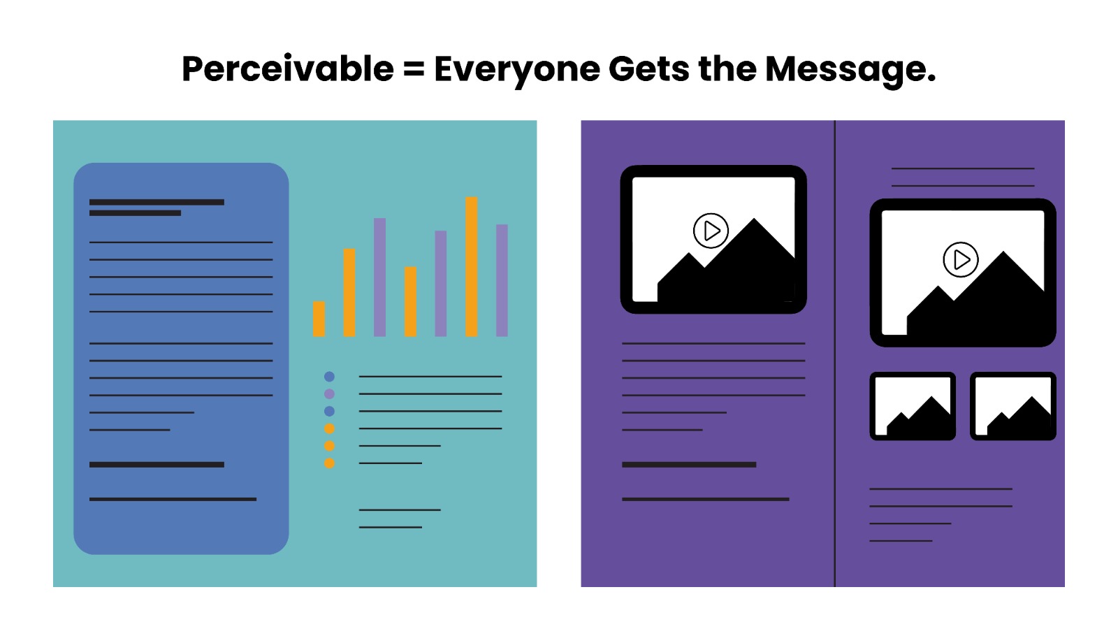
The first principle of accessibility — Perceivable — is about making sure that everyone, regardless of ability, can experience the information in your document.
What “Perceivable” Really Means (in Plain English)
People access content in different ways: by sight, hearing, or with assistive tools like screen readers. If your content is only presented visually, it might be completely invisible to someone who can’t see.
Being “perceivable” means your content is:
- Visible with enough contrast
- Understandable with alt text and captions
- Not reliant on color alone to convey meaning
Your Recipe to Make Content Perceivable
Step 1: Add alt text to every meaningful image
Describe what matters — not what it looks like, but what it communicates.
Step 2: Use high color contrast
Aim for a minimum of 4.5:1 contrast ratio for body text.
Step 3: Avoid using color alone to show meaning
Use patterns, labels, or icons alongside color.
Step 4: Provide captions or transcripts
If your document includes audio or video, make sure the content is available in text form too.
Quick Tip to Remember
“If someone couldn’t see this page, what information would they miss?” That’s your alt text.
Build with Inclusion From the Start
At Design53, we help organizations make their content clear and accessible to every reader — no matter how they consume information.