Create accessible Microsoft Word templates once and save hours of remediation. Use semantic styles (Heading 1–6), preset alt‑text prompts for images, accessible table and list styles, a default language, and the built‑in Accessibility Checker. Ship templates to your team with a short check list and you’ll dramatically reduce inaccessible documents and improve consistency across content.
Why this matters
Most inaccessible documents aren’t made by malice — they’re made by habit. People paste images without alt text, use visual formatting instead of heading styles, and rely on color or layout alone to convey meaning. For organizations that produce lots of Word documents (reports, proposals, templates, learning materials), fixing accessibility after the fact is costly. Investing 1–2 hours to build accessible templates pays back many times over: fewer remediation tasks, better screen‑reader experiences, and fewer complaints.Quick definitions (plain language)
- Accessible template: a Word file pre-configured so content created from it meets basic accessibility practices.
- Semantic styles: Word’s built‑in Heading 1–6, Normal, List, etc., used to signal structure to screen readers.
- Alt text: short description attached to an image so people who can’t see it understand it.
How to build an accessible Word template — step-by-step
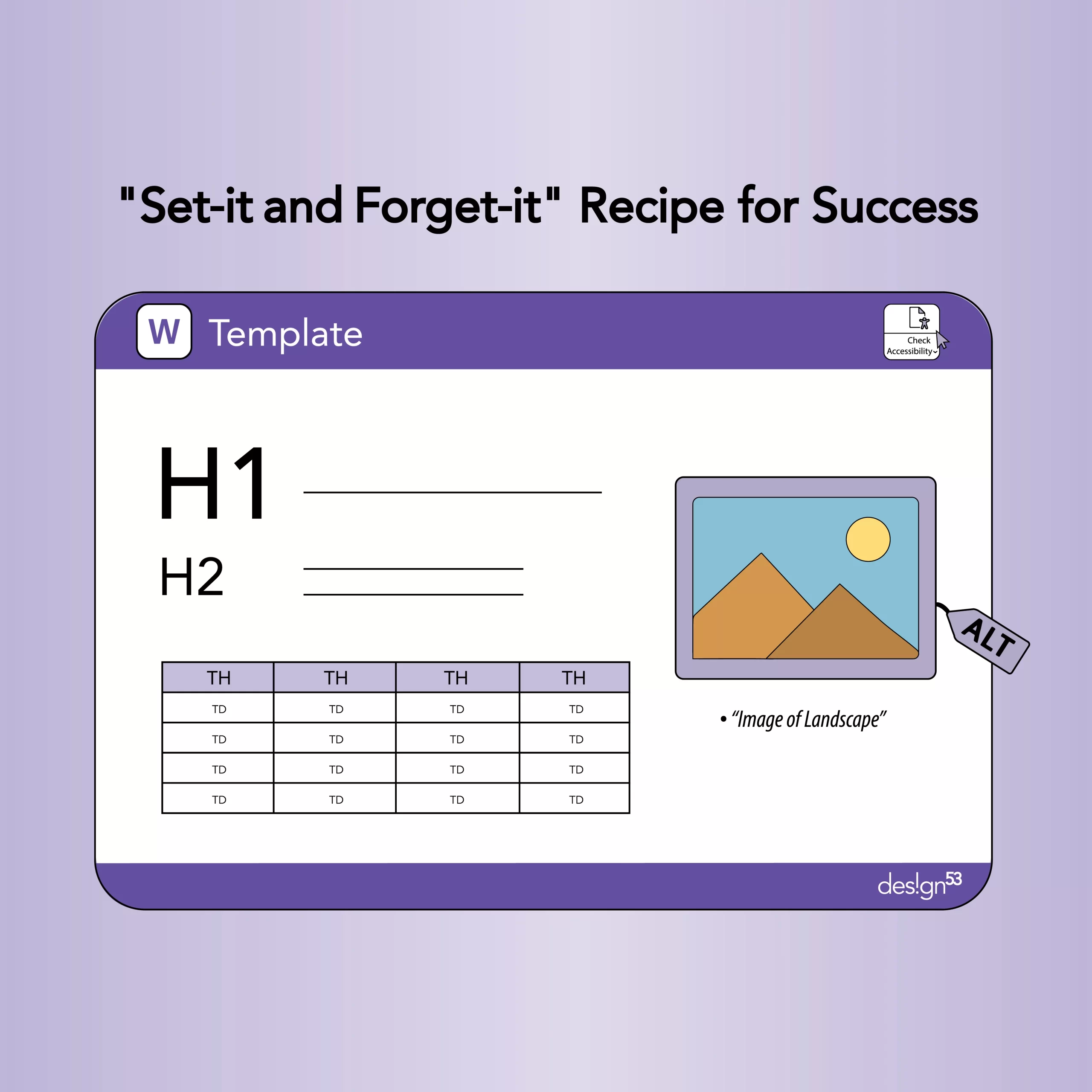
- Start with structure: use semantic styles
- Replace manual formatting with Word styles. Define Heading 1 for page titles, Heading 2 for major sections, Heading 3 for subsections.
- Set a readable default font size (e.g., 16px/12pt for body; larger for headings) and a high-contrast color palette (follow WCAG guidance; see university accessibility resources). Why: Screen readers and assistive tech rely on headings and styles to navigate content.
- Create accessible paragraph and list styles
- Define ordered and unordered list styles (with clear indentation).
- Provide a “Callout” paragraph style for important notes (so they don’t use bold/emoji alone). Why: Consistent, semantic lists and emphasis are easier to parse for screen readers.
- Preset table styles and include a table header row prompt
- Add a “Data Table” style with visible header row enabled and instructions in the template placeholder: “Use header row; avoid merged cells.” Why: Tables without headers or with merged cells are confusing to assistive tech.
- Add image placeholders with alt‑text prompts
- Insert an empty image frame with sample alt text like: “ALT: [Describe the image — explain its purpose, not just appearance].”
- In the template notes, explain difference between decorative images (mark as decorative) and informative images (add descriptive alt text). Why: Prompting authors to add alt text reduces missing descriptions.
- Set default document language and metadata fields
- Set the document language (Review → Language → Set Proofing Language).
- Provide template properties prompts (title, author, subject) to support accessible metadata. Why: Correct language tagging helps screen readers pronounce content correctly.
- Enable accessible hyperlinks and link text guidance
- Create a “Link” character style and sample inline link text that’s descriptive: “Download the accessibility checklist (PDF)” instead of “click here.” Why: Screen reader users often scan links; descriptive text helps them decide where to go.
- Add a short author checklist inside the template (visible, not hidden)
- Example checklist items: use headings; add alt text for images; run Accessibility Checker; check table headers; avoid color-only meaning. Why: A visible checklist reduces cognitive load and prompts quick fixes.
- Include a macro or ribbon shortcut (optional) to run Accessibility Checker
- Add a one-click macro or a documented step that runs Review → Check Accessibility and shows the result. If you use macros, clearly document how to enable them safely. Why: Making the checker extremely easy increases compliance.
- Test and ship a packaged template + training snippet
- Test the template with a screen reader (e.g., NVDA) or with Word’s Accessibility Checker. Fix any remaining issues.
- Save as .dotx or .dotm (if macros are included) and distribute via your intranet or document management system with a 1‑page cheat sheet.
Mini case example
A training team replaced their old report doc with an accessible template that included headings, image prompts, and a checklist. Team members reported faster handoffs to publishers because fewer documents required manual fixes; new hires learned the correct practices from the template itself. (Qualitative outcome: fewer remedial edits and clearer, consistent reports.)Practical checklist you can paste into templates
- Use Heading styles for titles and sections.
- Use accessible fonts and at least 12pt body size.
- Add alt text for every informative image; mark decorative images as decorative.
- Use table header rows and avoid merged/split cells.
- Use descriptive link text (no “click here”).
- Run Review → Check Accessibility before sharing.
- Confirm document language is set.
Tools & further reading
- Microsoft Word Accessibility Checker (built into Word).
- WCAG principles (perceivable, operable, understandable, robust).
- University accessibility guides on writing accessible blogs and documents (good practices for contrast and media).
Next steps / adoption tips
- Pilot the template with one team and gather quick feedback (10–15 minutes). Iterate based on the common mistakes you see.
- Pair the template with a one-page cheat sheet and a 5–10 minute onboarding video demonstrating how to use the template and run the Accessibility Checker.
- Make the template the default start document in your team workspace or intranet.
Conclusion + CTA
Accessible Word templates are low-effort, high‑impact tools. One well-designed template turns many creators into accessibility-aware authors overnight. If you want, I can build a branded Design53 template (dotx) and the 1‑page checklist for your team — tell me your brand fonts and any mandatory elements and I’ll draft the template content. Meta / publishing details- SEO title: The Hidden Accessibility Power of Word Templates — A Set‑It‑and‑Forget Recipe
- Meta description (150 characters): Make Word documents accessible by default. Build templates with headings, alt‑text prompts, table headers and a quick accessibility checklist.
- Estimated word count: ~1,200 (standard Design53 post)
- Hero image (screenshot of an accessible Word template open): Alt = “Microsoft Word window showing a document with Heading styles in use and an accessibility checklist.” Long description: “Screenshot of Word interface illustrating Heading 1 and Heading 2 applied, an image placeholder labeled ‘ALT: [describe image]’, and a visible checklist in a sidebar.”
- Image for table best practice (before/after): Alt = “Two small screenshots: a table with merged cells (problem) and a table with header row and clear cells (accessible).”
- Icon strip: Alt = “Icons representing headings, images, tables, and links — each labeled with its accessibility action.”
- Headings are semantic and in reading order.
- Images have alt text or marked decorative.
- All color contrast meets at least 4.5:1 for body text (verify with contrast checker).
- Links have descriptive text (no “click here”).
- Tables have header rows and simple cell structure.
- Document language is set in file properties.
- Accessibility Checker shows no critical errors before publishing.
- Make accessibility the default: build a Word template with headings, alt‑text prompts, and a checklist. One template, endless wins.
- Tired of fixing inaccessible docs? Try a set‑and‑forget Word template — it teaches authors good habits while saving time.